User Interface Introduction
| Back to User Guide |
Contents
- 1 Introduction
- 2 Screen Areas
- 3 Top Navigation
- 4 Tabs
- 5 Levels & Views
- 6 Advanced Grid Functionality
- 6.1 Selecting Rows
- 6.2 Column Filters
- 6.3 Column filtering and sorting configuration
- 6.4 Implicit Filters
- 6.5 Filtering in Selector Grids
- 6.6 Setting Column Visibility
- 6.7 Setting Column Order & Widths
- 6.8 Sorting
- 6.9 Grouping
- 6.10 Grid Summaries
- 6.11 Freezing Columns
- 6.12 Formula Columns
- 6.13 Summary Columns
- 6.14 Printing
- 6.15 Exporting grid content to a spreadsheet
- 6.16 Configuring export parameters in your Openbravo environment
- 7 Workspace & Widgets
- 8 Toolbar
- 9 Statusbar
- 10 User Messages
- 11 Sections
- 12 Keyboard Shortcuts
Introduction
The Openbravo 3 user interface is optimized for productivity. It is characterized by the following attributes:
- Multiple tabs that allow to have multiple documents open at the same time
- Master-detail views: Parent and child record information is shown in the same view
- In-grid editing: It is possible to modify field values directly in the grid
- Column filtering: Filter fields on top of the grid allow for real-time filtering while typing the keyword
- Application menu: A multilevel fly-out menu to discover and access all functional areas
- Quick menus allow for fast access to existing documents and creation of new documents
- Sessions: user and profile/role settings can be accessed via the top navigation
- Help can be accessed via the top navigation and help content will be opened on separate tabs
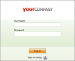
Login
You access Openbravo through a Web browser.
1. Enter your Openbravo URL into the address bar of the browser.
The login window opens up.
In case the login page is not being not displayed, please verify the correctness of the URL, or contact your system administrator.
| 3. Click login
The Openbravo Home page shows up. Google Account AssociationYou have the ability to log into an Openbravo instance using your Google Account by clicking the G-button that is shown on the login screen below the login button. There are two ways to use the Google Accounts authentication service:
Learn more about Google Account association in the Configuration Manual Screen AreasThe Openbravo 3 screen consists of the following components:
The top navigation offers the following menus or functionalities:
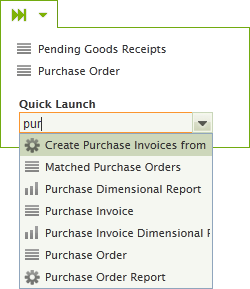
Quick MenusVia the quick menus you can quickly launch new documents or jump to existing documents.
Both QuickCreate and QuickLaunch work in the same way using auto-suggest based on the typed input. By simply entering the first couple of letters of the name of the document type, you will be offered suggestions for the type of document you are looking for. Application MenuThe Openbravo 3 application menu uses the same taxonomy as the 2.x versions, only the presentation has changed. Folders are replaced by expandable menus but its contents remain the same. The contents of the Application Menu depends on the user's role. For example, one user can have various roles and see different things with each. Users and roles are usually created and maintained by the client's Administrator. AlertsAn alert is a notification that informs or warns its recipients about a critical or very important situation that has arisen. With one click you can see and edit all your active alerts. The number of new alerts is shown in the top navigation as Alerts (n). Clicking this link will take you to the Alerts Management tab. This tab shows four sections, each one representing a status or stage in the alert life cycle:
In the Notes column, you can add a comment. You would typically do it when moving a New alert to (for example) the Acknowledged/read section. You can move alerts to a different section and clicking one of the buttons in the top right of the grid. The Record column contains clickable links. They let you open the (problematic) record on a new tab for further investigation. Help & AboutThe last item in the top navigation is the Help menu. It also contains an About item. Help content is opened on a new tab. User PreferencesClick the user name in the top navigation to access a user preferences menu. The menu is split in two tabs: Profile and Change Password
Log outThis button logs you out of the application. A confirmation dialog lets you confirm. TabsOpenbravo 3 allows you to have multiple transactions open a the same time on different tabs. You can switch between active tabs, just as you do using a modern internet browser. Tabs can be closed by pressing the X button. In case of overflow, when the total width of the tabs exceed the available horizontal space, three buttons appear to the right of the last tab that allow you to scroll through the tabs and easily navigate to one. Starting from version 3.0PR14Q2, it is possible to reorder tab position. To do it, drag the tab and drop it in the desired position. Starting form version 3.0PR15Q3, by default only one tab of a window is allowed. Only in case there is a module in development or the window is flagged as Thread Safe it is possible to have multiple tabs. Since this version there is a new Preference property Allow Multiple Tabs of a Window that enables the possibility to open more than one tab of a window. This preference can be configured by user, role and/or window level. Levels & ViewsAn application window consists of one or more levels: parent, child and sometimes even grandchildren and deeper. They are separated by a horizontal splitter bar. Each level can be displayed in grid or form view. Grid ViewThe grid view functions as the base view and often as a starting point to filtering and drilling down. The user can open a record in form view on top of the grid. The interaction metaphor that is used is that of a file explorer of an operating system. The grid is the folder with files, a double click opens the record. The record in form view can be closed at any time by clicking the close (X) button in the top right corner of the form. A record in the grid can be opened via:
Tree Grid ViewThe tree grid view is an alternative to the standard grid view that is available for tabs based on tables that have been defined as a tree. The tree grid view shows the tab data hierarchically. When the view is first loaded only the root nodes are shown. The user can then open individual nodes to load its children. To switch between the standard grid view and the tree grid view the user has to click the Tree toolbar button: The user can reorder the nodes of the tree, moving a node to another parent or to another position within its original parent. Some restrictions apply when moving a node:
Openbravo PR14Q3: There are some configurations that can be done at tab level:
When the tree grid view is filtered, not only the records that fulfill the filter criteria will be shown, also its parent nodes, until reaching the root node. This is done in order to show the filtered nodes in its proper context. The font color of the context nodes is grey in order to distinguish them from the nodes that actually fulfill the filter criteria. It is not possible to reorder the tree nodes while it is being filtered, as it some records are hidden the new position of the node could be ambiguous. It is not possible to create or edit a node using the tree grid view, for that the standard grid view should be used. What it is actually possible is to open a record in form view from the tree grid view. Then the record can be edited in the form view, and when the form view is closed the tree grid view will be shown again. If a user wants to use the classic tree popup instead of the tree grid view, he can use the Use Classic Popup Tree preference. Form ViewThe form view is used for more complex editing of individual records. Normally header records are created in form view because they e.g. a description which usually is too long to enter comfortably in grid view. The form view can be closed by
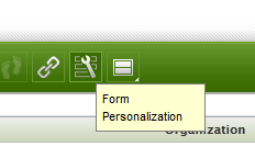
Form PersonalizationThis feature allows you to change the order and visibility of fields, and several other settings:
More detailed documentation:Window_Personalization
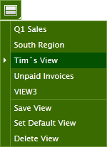
Activating, resizing, maximizing and toggling levelsEach application window is split in two visible levels. This can be either parent-child or child-grandchild (or even deeper down). The distribution of the height of each level is not fixed as it can be changed by dragging the horizontal splitter bar that divides the two levels. Only one level can be active at a time. An active level is marked with an orange vertical strip on the left hand side and an orange horizontal strip on top of the tab. You can toggle between active levels simply by clicking in a non-active level. The orange markers will move along. The standard view is parent-child (also known as header-lines). In case there is a third level available, it will sit at the bottom of the window in collapsed state. In order to expand the third level, you can simply click on its tab. It will then pop out and push the other levels upwards. In this case you will notice that the top level (header) will become collapsed. Here the same interaction principle applies: a single click on the header tab will make it re-appear. A level can be maximized by double clicking on its tab. Double clicking it again will restore its size to the previous size. Saving ViewsSaving Views stores grid and form settings, column filters and even the entire layout of the screen, for example the position of the splitterbar between the header and lines. So imagine that you rearranged your grid and it´s perfectly adapted to your task. You even added some column filters, for example you only want to see invoices that are more than 21 days overdue for organization East Coast. Now you save all this in one go using a name. Now when you need to work on another task that needs other filters and grid or form settings, you can easily retrieve this view later. You can access Saved Views through a pull down menu that sits underneath the Saved Views button in the toolbar. A saved view can be set as default and can be deleted. The active view is indicated by a little arrow in front of the view name. As an administrator you are able to save predefined views on different levels (client, org, role) which are made available to users. As a regular user you can only edit/save views on your own levels and not change views entered by an administrator. More detailed documentation: Window_Personalization
Advanced Grid FunctionalityThe Openbravo 3 grids let you browse, select, filter and organize high volumes of records with ease. Listed below are the main capabilities of the new grids. Selecting RowsRow(s) in grids can be selected as follows:
In the top left of the grid, two numbers are shown. The first one indicates the number of selected rows, the second one the total number of rows in the grid. Column FiltersOn top of the columns in a grid you will find column filters. There are several types of column filters:
The following symbols can be used in regular column filter fields to create more complex filter expressions. Note that once you start typing a filter expression in a numerical value column, the real-time filtering is switched off and you will need to hit Enter to apply the filter.
Client FilteringWhen applying column filters in a grid, a new request is done to backend to retrieve the filtered data set. In case of applying a filter more restrictive than the one used to retrieve the previous one and if the complete data set for that previous filter has already been completely retrieved from the client (this is, the number of records matching the filter is equals or smaller than the page size -100 records-), the filtering is done in the browser without the need of doing additional requests. This implies a better performance in these cases saving backend trips. Grid Configuration
The behaviour of the grid filters can be configured by system administrators at System level (Grid Configuration at System Level window) or Tab and Field level (Grid Configuration at Window/Tab/Field Level). Tab configurations will overwrite system configurations, and field configuration will overwrite tab configurations. Grid configuration also can be configured to determine if a column is sortable or not. Working with high volume of data we recommend to deactivate sorting and filtering in some/most columns in backend grids. How to configure high volume windows. The following parameters can be configured in these windows:
Column filtering and sorting configurationEvery column in Openbravo is filterable and sortable by default. Every column has two checkbox fields which are called Allow Sorting and Allow Filtering that are checked by default. Those checkboxes can be unchecked to make the columns not sortable or not filterable. This can be configured by system administrators in the Tables and Columns window and there it can be chosen the column of which one wants to change the default sorting or filtering properties. These defaults can be overridden by a Grid Configuration. In case sorting or filtering is allowed for a column, its behavior can be overridden by a configuration at any level. But if filtering or sorting is disabled, it can be only be enabled by a configuration at field level. Implicit FiltersSome grids, especially those with large data volumes, have preset hidden filters, the so called implicit filters. Typical implicit filters are set to filter out already process transactional documents or documents before a certain date. Implicit filters can be cleared by clicking the funnel icon in the top right of the grid. Filtering in Selector GridsSelectors make use of modal dialogs containing grids. Selector grids work in the same way as regular grids. Often, they also contain preset implicit filters that can be cleared by clicking the funnel icon. Typical cases where selectors are used are business partner and product selection. Setting Column VisibilityVia a right-mouse-click on any column header, a context menu can be invoked. In this menu, you can set the column visibility via the Columns item by ticking or unticking the column (field) names. Setting Column Order & WidthsColumn order and width can simply be modified by dragging the column header or separating split line to another position. SortingColumns can be sorted by clicking on a column header. A second click sorts the column in the reverse order. A triangle symbol conveys the current ordering. Client SortingIn the same way to Client Filtering, when the number of records matching current filters is equals or smaller than the page size -100 records-, sorting is directly done in the browser instead of performing additional request to backend. Disable SortingSorting can be disabled at System, Tab or Field level by configuring the By Default Allow Sorting parameter in the Grid Configuration at System Level and Grid Configuration at Window/Tab/Field Level windows. Sorting LazilyIf the Lazy Filtering on Grid parameter is set to true (for more information about grid configuration click here), then when the user clicks on a field title in order to sort the grid using that field, the sorting will not be applied until the user types Enter on a grid filter or until he clicks on the check icon below the funnel icon. This reduces the number of datasource requests, allowing the user to change the sorting and change several filters and then do only one datasource request. GroupingRecords can be grouped by a certain value/column (available from MP17). Grouping is not enabled by default. The 'Grouping Enabled' preference should be set. To group click on the column header context menu and select 'Group by...'. The display of grid will now show the records in a grouped manner. If the dataset is too large then grouping is disabled. A message is displayed if a large dataset is grouped. The maximum number of records which can be grouped is also controlled by a preference: 'Maximum Number of Records for Grouping'. To ungroup, click the 'ungroup' option in the column header context menu. Grid SummariesThe grid allows you to set summary functions for a column. These summary values are shown in a separate row in the bottom of the grid. The summary functions are executed on the server so they operate on the complete dataset which fits into the current filter. To set a summary function click on the column header context menu and go into the 'Set Summary Function' submenu. Numeric and date fields will have several summary functions, other fields will only have a 'count' summary function. You can remove the summary row by clicking on the 'Clear Summary Functions' option in the column context menu. It is also possible to set a summary function in the Application Dictionary (in the Window, Tabs, Field window in the Field tab). This summary function is then enabled by default when opening the target window. See the screenshot on the right on how to set this in the Application Dictionary. Valid summary functions are: avg, count, max, min, sum.
Summary functions are not supported on tabs defined based on HQL Query Tables. For this reason, since 3.0PR17Q1 the 'Set Summary Function' submenu is not available for this kind of tabs. As computed columns allow to be defined with any arbitrary sql statement, the risk of underperformance when included in a summary function is much bigger. For this reason Summary functions are not supported in computed columns. Summary functions are not supported on tabs defined based on Datasource Tables. For this reason, since 3.0PR18Q1 the 'Set Summary Function' submenu is not available for this kind of tabs. Freezing ColumnsFreezing columns means that they will be kept in the same position regardless of the position of the horizontal slider bar. Freezing column(s) is typically done when information in the right hand side of the grid (that is accessed via horizontal scrolling) needs to be viewed in the context of columns on the left hand side. Columns can be frozen via the grid context menu that is invoked via a right mouse click on a column header. Formula ColumnsA formula column shows the outcome of an equation using values of two or more columns. Via the context menu (right mouse click on column header) the formula dialog is launched. Here, you enter the title of the column and the actual definition. Every column containing numerical values is represented by a capital letter. These letters are used to build the formula. For example:
The formula to sum these two is: A+B Summary ColumnsSimilar to the formula columns, the summary columns simply combine to non-numerical values into a single string. The columns are represented by capital letters. When building the expression the pound sign (#) needs to be used to identify them as values. PrintingWith the print button of the toolbar (
Direct PrintFor the windows related to the standard documents (goods shipments/receipts, orders, invoices and payments) it is also possible to configure them for direct printing, i.e, instead of downloading the printed report, the print page of the browser is directly opened with the report information. To enable this print mode, the Direct Print preference should be used and the browser must be configured to directly open the PDF files instead of downloading them. This link explains how to configure it in Chrome. Please note that this feature relies on the functionality provided by the browser and not all the supported browsers currently support it. For example, Mozilla Firefox ESR browser does not support it due to this bug. Refer here for a list of browsers where the direct print has been tested. Exporting grid content to a spreadsheetOpenbravo 3 allows the user to export grid content to a CSV file (Comma-Separated Values) via a button in the toolbar( To configure the export functionality correctly, follow these guidelines:
Configuring export parameters in your Openbravo environmentYou can change the decimal separator, the field separator, and the encoding of the file you get when you use the Export to Spreadsheet functionality in Openbravo if you need them to be different from the default values. This is done via preferences. After logging in to Openbravo, go to the Preference window and do the following:
Since Openbravo 3.0PR14Q4, it also possible to define a header and/or footer text that will be included into any CSV file exported from the grid content. This text can be used, for example, for legal purposes (confidentiality of data, restrictions, etc.). This configuration is done via two new preferences: "CSV Header Message" and "CSV Footer Message" in the same way as described above. In the "value" field you can either specify any plain text or alternatively the search key of a Message defined into the Application Dictionary. The former will directly include the plain text message into the CSV header or footer, and the latter will include the correspondent message's text, translating it to the user's language if available. After creating the preference (or preferences), log out of the application. Log in again, and try the Export to Spreadsheet functionality, to see the results. Workspace & WidgetsThe first tab contains the Openbravo Workspace, a customized portal-style home page. This tab cannot be closed as its contents are essential. Widgets are customizable and the available set will be dependent on role and instance activation status. To add widgets, simply click the Add Widget>> link in the left column in the workspace and select from the library. Administrate widgets for other clients or rolesWith the appropriate administrative rights, you can pick widgets for others users or clients in your organization. Via the Admin Others >> link on the left hand side of the workspace you can choose for which entity (client), organization or role you want to define a widget set. On the subsequent page you can then add widgets to this user´s / client´s workspace. Once done, click the Publish button to broadcast the selected widgets to the user(s) in the chosen entity/organization/role. The next time they log in, they will find the newly added widgets on their workspace. ToolbarThe Toolbar contains two types of buttons: Action buttons (green) and Process buttons (orange). Actions are generic and can be applied to almost all selected records. Processes are record specific and depend on the record status and the active level (header or lines or lower). The action buttons perform the following actions: StatusbarThe statusbar conveys the editing status of the document (New, Editing or Saved) together with a user-defined set of read-only attributes. These allow the user to get an overview of the document without having to scan the remainder of the form. The statusbar is only visible in form view. On the right side of the statusbar the following buttons are available:
User MessagesUser Messages are displayed centrally and their function is to inform or warn the user about some occurring situation in the application. There are four different types of user messages.
The messages can be hidden by clicking the little X icon in the top right of the message. SectionsForms contain sections that group assets such as linked items, notes, attachments and groups of related fields. Sections can be expanded and collapsed by clicking on their header or the twisti (triangle shaped icon). More InfoIn this section the less frequently used fields are placed so they won´t bother you in the main part of the form. AuditIn this section the fields related to audit are placed. Just as for the More Info section, the reason they were tucked away here is to reduce the visual clutter in the main part of the form. NotesIn this section you can add notes related to the document. These could be notes to self or to colleagues. The bar on the left hand side is colored gray for your own notes and green for notes added by someone else. This way you can identify in one glimpse which notes aren't yours. Linked ItemsIn this section all related documents to the active document are shown. The left column contains the window types with the amount of related documents shown in brackets. By selecting one of the window types to the left, the actual documents appear in the right column. The links are clickable and will launch the document on a new tab. AttachmentsIn this section the attachments to a record are stored. For more information on attachments and the API used to get attachments, refer here. Starting from 3.0MP31, it is possible to have a description for each attachment. Keyboard ShortcutsThis list is just a starting point. As it is virtually impossible to find the ideal set of keyboard shortcuts for all platforms and languages it is recommended to modify and create your own. You can do this in the General Setup |
